
By Darious Kajjo | Busoga like any other region in Uganda has a regional referral system where specialists from the regional hospital support district hospitals in the catchment area for improved health service delivery. However, the quality of care for maternal and newborn services remains poor. The Makerere University School of Public Health (MakSPH) with funding from its partners established the Makerere University Centre of Excellence for Maternal Newborn and Child Health to initiate and implement low cost interventions/projects in maternal and child health (MNCH).
Notable among projects implemented in the region is the Preterm Birth Initiative (PTBi 2015-2019) study which I have been involved with for some time. This project is in 5 districts and 6 hospitals of Busoga Region (Jinja, Iganga, Bugiri, Kamuli and Mayuge). Through our interventions I have seen data collection and data use strengthened, use of checklists to guide care and midwives trained to advance their skills in management of mothers and babies. I have been able to witness ultra sound scan technologies at labour wards, something rare in hospitals of other regions. In the community, we have set up a system of follow-up of all registered preterm babies after one month to understand best care community practices and mortality at 28 days.
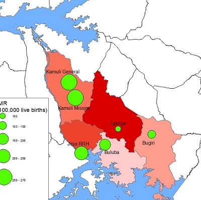
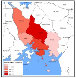
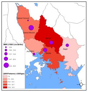
While all these interventions happen, we notice variations in different districts in maternal and newborn outcomes. We would wish always to put resources where they are most wanted but how do we tell the right locations? Geographic Information Systems (GIS) and Mapping can help guide you arrive at this. I use maps to show where we have seen variations in key maternal and newborn indicators. Data visualized in maps 1-4 was collected from October 2016 to May 2018 from the 4 Government own hospitals (Jinja Regional Referral Hospital as well as Iganga Hospital, Bugiri, and Kamuli General hospitals) and 2 Mission Hospitals namely Kamuli Mission and St Francis Buluba.
Where do most births happen?
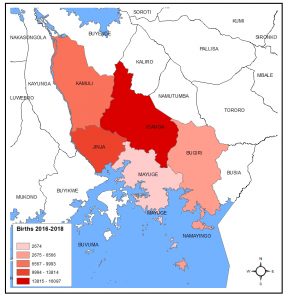
When we use maps with different shades of colour red to display this data to view where most births happen, Map 1 shows that Iganga district and its catchment had the highest number of births (16,087), followed by Jinja (13,814), Kamuli (9,993), Bugiri (6,566) and Mayuge district had the least deliveries (2674). In Map 2, when Low Birth Weight/preterm total of 5,812 births is distributed, Iganga still has the highest percentage LBW (14.5%), followed by Mayuge (12.7%), Kamuli (11.5%), Jinja (10.9%) and Bugiri (7.4%).
Iganga receives the highest number of admissions and as such has highest number of births in the region unlike Jinja, which is a regional referral hospital. Many reasons can explain this, and the geographical location of these facilities plays a great role to explain these variations. To note, the two hospitals lie along Kampala-Tororo highway. It is important to note that type and condition of transportation route can influence access and utilization of health services. Also, the two are the most urbanized in the region meaning they have more feeder routes connecting the rural extents. It should not also be forgotten that Iganga’s catchment goes beyond the districts of Bugweri, Kaliro, Namutumba and Luuka that do not have hospitals. Buluba in Mayuge District has the least number of deliveries because apart from being a paying hospital, its bigger boundary is bordered by a lake and districts that have hospitals. Most mothers attend to free public hospitals at neighboring districts and TBAs (traditional birth attendants).
Where is most mortality?
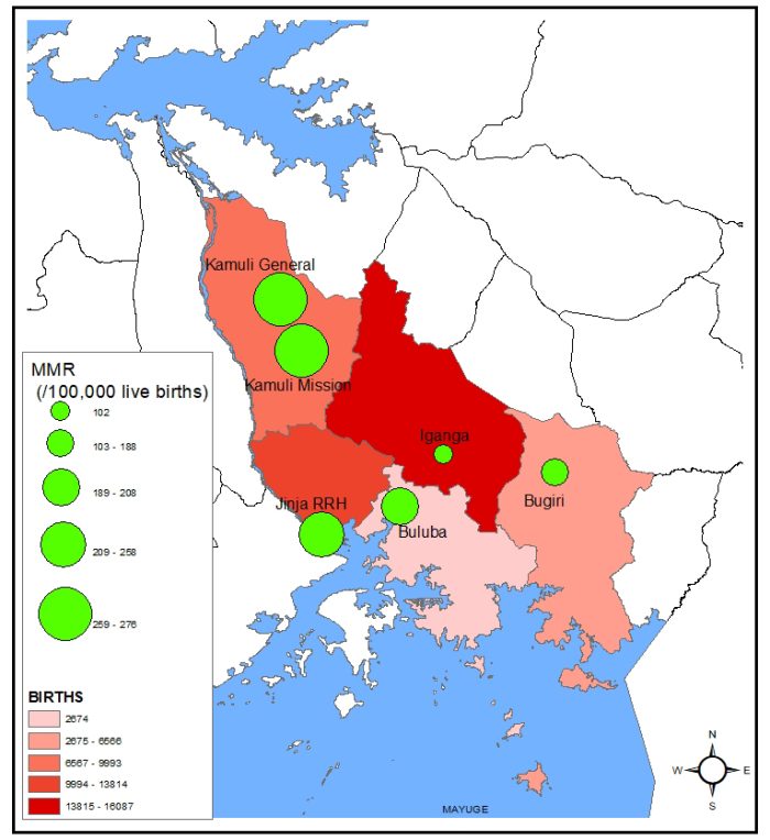
The number of mothers who die per 100,000 live births varies in every hospital. As shown in Map 3 and 4, the circular green spots represent maternal mortality while purple represents neonatal mortality. The spots also show location of hospitals and their relative sizes shows the level of mortality (The smaller the spot the lower the mortality). It can be visualized that much as Iganga had the most deliveries, it has the least maternal mortality at 102 deaths per 100,000 live births while Kamuli that was third in rank of number of deliveries has the highest mortality in the two hospitals of Kamuli Mission (276) and Kamuli General (268). When it comes to number of newborn deaths (at 7 days), Kamuli Mission has the most neonatal mortality at 30/1000 live births followed by Iganga that had the highest deliveries at 22.3 per 1000 live births. Kamuli General and Jinja hospitals have the least neonatal mortality at 10.4 and 13 respectively.
Implications to Health systems strengthening
In the maps, we have seen that dark shades represent over concentration of an indicator in that geographic region. For example, Iganga having many births and a high number of low birth weight babies and Kamuli having high mortality. This means that when distributing services Iganga and Kamuli become the target areas to introducing life saving interventions. These can include improving health service infrastructure, recruitment of competent health service personnel among others.
From these maps we also learn that Kamuli hospitals need more interventions in saving mothers and babies. Some of the reasons for high mortality in Kamuli General was lack of doctors, lack of reliable electricity source while at Kamuli Mission and bad referrals.
Sources: Data collected from Hospital registers and the maps were developed using ArGIS.
*The Writer is a GIS specialist and works with the Preterm Birth Initiative as a Data supervisor. Email: kjjdarius@gmail.com